Printing Terms & Tips
Graphic designers have a tricky job. They are expected to be mind readers of their clients or bosses, have hundreds of creative ideas flowing out of them constantly, be technically savvy, and create brilliant pieces on a tight budget.
So, if you want to be an artist, psychologist, magician, accountant, and engineer all rolled into one; this is where to begin!
Bleed
A bleed is the extension of an image, color, or any element outside the trim line of the print piece, typically 1/8” (0.125”) past the edge of the print. A bleed is created in the design to ensure that once the paper is trimmed to its finished size, the edges do not show any white paper. If a bleed is not created, and the printed piece is not cut perfectly, a white line will appear outside the image or element along the edge.
Full Bleed
A “full bleed” is an extension of image over all four sides of the piece. You may also see designations of “bleeds top,” meaning that the image only extends past the top edge. Similarly, you may designate a job “bleeds bottom,” “bleeds left,” or “bleeds right.”
Bleed in a multiple-page piece
In a print piece with multiple pages, such as a book or brochure, a bleed should be incorporated. After the sheets have been printed, folded, and bound, they will need to be trimmed. The inner pages will shift outward slightly due to the thickness of the paper. This is called creep or shingling. The book or brochure will need to be trimmed to end evenly.
Color
There are two main printing processes for offset print: 4-color process (CMYK) printing and spot color (generally using Pantone ink recipes) printing.
For us Americans, Pantone is the most widely accepted developer of a color system that creates brighter, more vibrant print results than CMYK, but has a smaller color range. Spot colors are a single ink color, referred to by their Pantone number. If there is only one color to be printed, there will be a single plate and a single run of the press. A spot color can be added to a CMYK print with a five- or six- color machine. Spot colors are typically used for corporate colors or specific product colors.
4-Color Process Printing
4-color process printing involves the use of four plates: cyan, magenta, yellow and black. The CMYK artwork is separated into these four colors, with one plate per color. These four plates combine to make all the colors in a color print piece.
RGB Color
RGB color (red, green, blue) is used for screen-based applications, such as computer and video, but never used in print. Frequently, photography will be in RGB and will need to be converted to CMYK before print. RGB pieces will look fine on your computer monitor, and may print well on an inkjet or laser printer, but the results from an actual printing press will be completely unpredictable and should never be done.
Rich Black
The black ink used in CMYK offset printing will not produce a very dark, dense black. If printed in large blocks, 100% black can instead look like a dark grey. To create a completely opaque, dense black (what is called a rich black), designers add some of the other printing colors to the black.
The most popular recipe for rich black is to combine 40% cyan, 40% magenta, 40% yellow, and 100% black.
Remember – rich black should not be used for thin lines or small type to minimize registration issues.
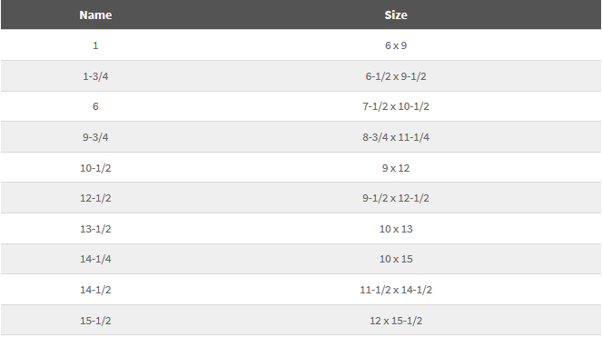
Envelopes
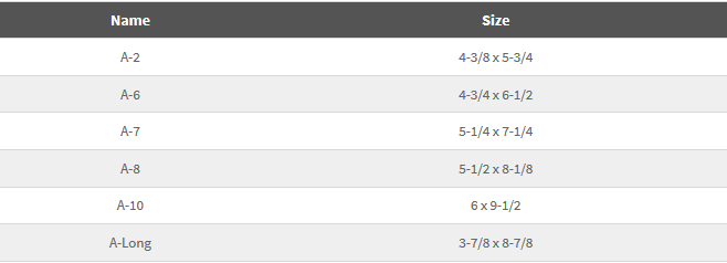
“A” Envelopes
These envelopes have a square flap. Some have deckle edges. Because they are available in many colors and finishes with matching text and cover papers, they are good choices for announcements, informal invitations, booklets, and brochures.
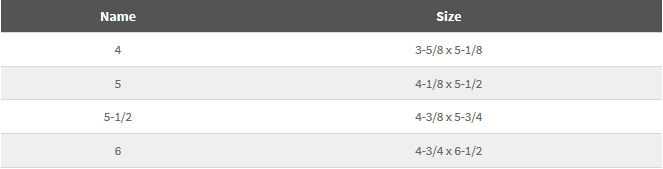
Baronial Envelopes
These envelopes have a pointed flap. Baronial envelopes and cards are used primarily for formal business purposes. Matching enclosures can be ordered with or without a raised border panel.
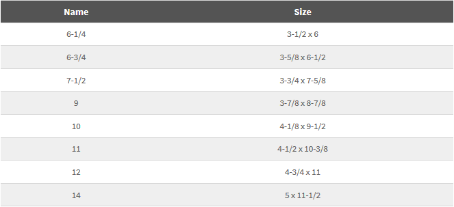
Commercial Envelopes
Used for personal and business correspondence including letters, statements, and invoices, and for reply mail, these envelopes can also be ordered with standard die cut windows. Many number 10 envelopes are color matched as part of a letterhead package.
Booklet Envelopes
Also known as “open-sided” envelopes, booklet envelopes are used in high volume mailings because they are machine insertable. They can be ordered with a self-sealing option, and in durable synthetic papers.
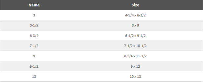
Catalog Envelopes
Also known as “open-end” envelopes, these generally require hand insertion of enclosures. They can be ordered with a self-sealing option, and in durable synthetic papers.
Fonts
There are three main categories of fonts: OpenType fonts, TrueType fonts and Postscript (or Type 1) fonts.
PostScript
PostScript (also called Type 1) fonts have two files. One file contains the information to display the font on screen and the other file is for printing. When PostScript fonts are delivered to the printer, both versions (print and screen) must be provided.
The screen font is a font suitcase containing all the information necessary to render a scalable font on your computer monitor. Often the name of this file will be the full font name (Futura-Bold).
The printer font contains vector outlines of the font and is often named with an abbreviation of the full font name (FuturBol).
TrueType
TrueType fonts were designed to eliminate the need for multiple files. They contain both the screen and printer versions of the font in a single file.
When packaging your file, you will not see two files for each font as you will when you use PostScript fonts.
TrueType fonts make up the majority of the fonts that have come automatically installed on Windows and Mac operating systems for years.
OpenType
In 1996, Adobe and Microsoft surprised the entire industry by announcing that they would jointly develop a new font format that would merge the two main font technologies, PostScript and TrueType. This new technology was code named OpenType.
OpenType is the new standard for digital type fonts. It contains in one file, all the information necessary to render fonts correctly both on screen and in print. The main benefit with OpenType fonts is that they are cross-platform; the same file will work on both a Windows and Macintosh system. It will also support rich typographic features such as small caps, old style figures, and ligatures — all in a single font.
When packaging your file, you will not see two files for each font as you will when you use PostScript fonts.
Which Font is Which?
You can tell what most font types are by looking at the extension.
Windows
- .ttf = TrueType
- .ttc = TrueType Collection
- .pfb and .pfm = PostScript
- .otf = OpenType with PostScript Content
- .ttf = OpenType with TrueType Outlines
Mac
- .ttf = TrueType
- .ttc= TrueType Collection
- .otf = OpenType
- .dfont = a version of TrueType
- No extension = either a TrueType or PostScript font for TrueType fonts, Mac Type is .FFIL or .tfil for PostScript fonts, Printer Font Mac type is LWFN. Suitcase Mac type is FFIL
Another way to tell which type of font you are using in InDesign is to open your file and click Type > Find Font. A window listing all the currently used fonts will open.
The OpenType fonts appear with an “O” icon next to them, the PostScript fonts have a red “a” icon and the TrueType font icon has a gray and a blue “T.”
A third way to tell is by using font management software. Such programs should list the type of font next to its name.
Sending the Correct Files to Print
Packaging your file in InDesign will create a folder containing all the information necessary for a commercial printer to print your document. Inside this folder will be another folder for fonts, and one for links (images). Sending your printer this folder will bring you one step closer to being Prepress’s new best friend.
Image Resolution
Bitmap
For bitmap (raster) images, resolution describes how many pixels fit in one inch, commonly referred to as dpi (dots per inch).
When an image is used for print, its resolution is important in producing the best possible quality result.
Since a digital image is not physical, its pixels don’t really have a size. However, there are a set number of pixels in the image. When you print the image, the pixels do get actual dimensions. If the image has too low of a resolution, the limited number of pixels per inch will make the image have a jagged, fuzzy, or blocky look.
If the resolution of an image is too low, the print will:
- not be crisp and sharp
- pixelate the images
- show straight lines as ‘stair-stepping’
For print, we recommend a resolution of 300dpi
Newspapers are printed at a very high speed on low quality paper, and so a dpi of 200 – 250 is required.
For billboards and very large signage, the viewing distance is increased to the point at a dpi of 50 – 100 is adequate.
Screen vs. Print Resolution
Do not assume that an image that appears clean and crisp on a website will have the same sharp appearance in print. Screen or website images are typically low resolution, and do not have a high enough resolution for print work.
InDesign File Packaging
Before you send your InDesign files in to print, you will need to gather all of its parts together by packaging the file. When you package a file, you create a folder that contains the InDesign document (or documents in a book file), all necessary fonts, linked graphics, text files, and a customized report.
To package your InDesign file, open your document and click File > Package… In the dialogue box that opens make sure there are no missing fonts or images and click the “Package…” button. A window will open that asks for contact information; this will create a .txt file that the Prepress department will use to contact you if there are any issues. Click “Continue.” Give your packaged folder a descriptive name and choose a location to save it. A folder will then be created with everything the printer will need.
InDesign performs an up-to-date preflight check that will help you ensure all fonts and images are linked or embedded, and that the colors are correct. The Package Inventory dialog box indicates any detected problem areas and has several menu options that can help you locate issues in your InDesign document you may not have noticed.
Summary
Information about the document is displayed here, including any errors that are found (such as images that are not in CMYK, missing fonts or images).
Fonts
This lists all the fonts that are used in the document. It tells you the name of the font, what type it is (postscript, truetype, etc), and if it is present or missing. If there are errors select the specific font and then click “Find Font…” to see available options. You can change the font in the “Find Font” window, if you wish. Each instance of the original font will be changed to the new font you specify in the “Replace With” section of the “Find Font” dialogue box.
Links and Images
This section will tell you if there is anything wrong with your images. Make sure there are no missing images (if there are, select the image and click “Relink” to find it). If you have images that were created in the RGB color space, a warning will appear here. You can edit your images in Photoshop or Illustrator and convert them to CMYK if you wish, or you can let our Prepress department do this.
Colors and Inks
Process (CMYK) and spot colors are listed in this view. You should see Process Cyan, Process Magenta, Process Yellow, and Process Black. If there are spot colors listed you may want to go back to your document and convert those colors to process, unless your printer knows you intend to use spot colors. You can change spot colors in your InDesign document by canceling out of the Package window and right clicking on the spot color in the “Swatches” palette. Select “Swatch Options,” then change the Color Type to “Process.” Go back to the Package window by clicking File > Package.
Print Settings and External Plug-ins
These are a list of settings and plug-ins that are used in the document. They cannot be changed in the Package dialogue box.
For more information, visit Adobe InDesign’s Help page.
Paper
What kind of paper would you like to use on your next project? If that question makes a chill go up your spine, we’re here to help. Paper weight is a confusing topic, but we have the answers, and can provide you with a cheat sheet for reference, too!
When a paper is being described to you, it will have two parts, a weight and a category, such as a 60 lb. Text or an 80 lb. Cover. You may also see these abbreviated as 60#T and 80#C.
There are five basic categories of paper that you will deal with on press:
Writing
This common paper is used in a wide variety of applications, from business forms to household stationery. It is a strong sheet used in most copiers and desktop printers in the form of 8 ½” X 11″ 20lb. standard copy paper. Also called “Bond,” “Ledger,” or “Duplicator.”
Text
Found in books, announcements, and brochures, this is well suited for two-sided printing, very durable, and relatively inexpensive. Also called “Book,” or “Offset.”
Cover
Cover paper is also known as yardstick, and is a heavyweight, stiff sheet that folds and resists damage well. Because of its durability, it is commonly used in folders, business cards, greeting cards, and post cards.
Tag
Tag paper is dense and strong, used for store tags.
Index
Index paper is stiff, inexpensive and absorbs ink well, making it the prime choice for index cards and business reply cards.
To determine the weight of the paper, the manufacture weighs a ream (500 sheets) of the paper’s parent sheets. This is called a basis weight, and it is where we get the 60lb. in our 60lb. text. But, the 8 ½” X 11″ sheets of paper that we are used to dealing with aren’t the size of a parent sheet. The different categories of paper have different parent sheet sizes. Here is a list:
Parent Sheet Sizes
- Writing: 17″ x 22″
- Text: 25″ x 38″
- Cover: 20″ x 26″
- Tag: 24″ x 36″
- Index: 25 ½” x 30 ½”
While different paper types have different parent sheet sizes, papers can still be compared by using equivalent weight. The table below is intended to serve as a guide only. The values should not be used as specifications, since there are variances with different paper manufacturers.
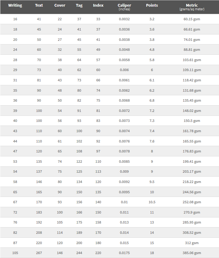
Caliper
Caliper is the thickness of a sheet of paper expressed in thousandth of an inch. This measurement is taken with a micro meter. Normally, paper caliper should not have more than a plus or minus 5% variance within a sheet. Usually the greater the caliper (or the thicker the paper), the greater the paper weight, but this depends on the density and finish of the paper.
Point
Card stock thickness can sometimes be expresses in points, as in a 12pt. stock. Points are the thickness of the sheet in thousandths of an inch, with one point equaling 0.001 inch. So, a 10 pt. cover stock is 0.010 inches thick and roughly corresponds to a weight 90 lb., or 250 g/m2 . A 12 pt. card is 0.012 inches thick.
Metric Grams Per Square Meter
Most countries use the international paper weight system that calculates grams per square meter. However, USA and Canada use the British weight system. In order to prevent any possible confusion on both sides, we provide the conversion table for the equivalent paper weight.
The metric system is standard across all weights of papers. For example, a card stock may be a 80lb. Cover or 80lb. Text. But in the Metric system, the same papers would simply be 216 g/m2 and 104 g/m2, respectively (the first being twice as thick as the second)
When selecting a paper weight, it is important to be aware that European and Asian sheets typically contain less paper pulp and more surface coating than American sheets. While an American sheet and a European sheet might both be specified as 100 lb., for instance, the European sheet would feel less bulky and would likely have less opacity than the comparative American sheet.